New Features of ZK 6.5
 Author: Timothy Clare, Potix Corporation
New Features of ZK 6.5
Author: Timothy Clare, Potix Corporation Date: September 2012
Overview
ZK 6.5 introduces responsive design capabilities, HTML5 support enhancements, and new mobile-friendly components. This release focuses on enabling developers to build applications that work seamlessly across desktops, tablets, and mobile devices – all from a single codebase.
Responsive Design and Responsive Components
Supporting multiple device types has always been a challenge. With ZK 6.5, you can provide an optimal user experience across all devices without writing two applications or maintaining multiple pages.
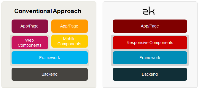
Responsive Components (EE)
ZK 6.5 Enterprise Edition introduces responsive components that adapt their behavior based on the device type. These components support seamless mouse and touch events, including swipe gestures for grid page navigation and touch scrolling.
Touch Event Detection (CE/PE/EE)
ZK 6.5 captures swipe events across all editions. The SwipeEvent provides horizontal and vertical distance, duration, and direction data.
<tabbox height="300px" width="300px">
    <tabs>
        <tab label="tab 1" />
    </tabs>
    <tabpanels>
        <tabpanel>
            <attribute name="onSwipe"><![CDATA[
                SwipeEvent se = (SwipeEvent) event;
                lbl1.setValue("Horizontal: " + se.getSwipeX() + "px");
                lbl2.setValue("Vertical: " + se.getSwipeY() + "px");
                lbl3.setValue("Duration: " + se.getSwipeDuration() + " milliseconds");
                lbl4.setValue("Direction: " + se.getSwipeDirection());
            ]]></attribute>
            <vlayout>
                Swipe information
                <label id="lbl1"/>
                <label id="lbl2"/>
                <label id="lbl3"/>
                <label id="lbl4"/>
            </vlayout>
        </tabpanel>
    </tabpanels>
</tabbox>
Detect Orientation Changes (CE/PE/EE)
Using the onClientInfo event, your application can detect orientation changes and adjust the layout dynamically.
<tabbox id="tbx" height="400px" width="600px">
    <attribute name="onClientInfo"><![CDATA[
        ClientInfoEvent oe = (ClientInfoEvent) event;
        lbl.setValue(oe.getOrientation());
        if (oe.isPortrait()) {
            tbx.setHeight("600px");
            tbx.setWidth("400px");
        } else {
            tbx.setHeight("400px");
            tbx.setWidth("600px");
        }
    ]]></attribute>
    <tabs>
        <tab label="tab 1" />
    </tabs>
    <tabpanels>
        <tabpanel>
            Current Orientation: <label id="lbl"/>
        </tabpanel>
    </tabpanels>
</tabbox>
Further HTML 5 Support
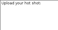
File Upload with Drag and Drop (EE)
ZK 6.5 Enterprise Edition supports dragging and dropping local files from the filesystem directly into the browser for upload.
| Drop area | File dragged over area | Image uploaded and displayed |
|---|---|---|
 |
 |
 |
<zk>
    <vlayout>
        <image id="img" />
        Upload your hot shot:
        <dropupload maxsize="-1" content="content"
            detection="browser"
            onUpload="img.setContent(event.media)" />
    </vlayout>
</zk>
Input Elements Support HTML 5 Types (CE/PE/EE)
ZK textbox now supports HTML 5 input types including tel, password, url, and email:
<textbox type="tel" />
<textbox type="password" />
<textbox type="url" />
<textbox type="email" />
Input Element Placeholder Support (CE/PE/EE)
You can display hint text within input fields using the placeholder attribute:
<textbox placeholder="Please type some text" />

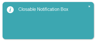
Closable Notification (CE/PE/EE)
Notifications now support a close button, allowing users to dismiss them immediately rather than waiting for the timeout.
Clients.showNotification(msg, true); // adds a close icon on the top right corner
Calendar Week Number Display (EE)
The calendar component can now display the week number within the year, which is useful for date-sensitive applications.
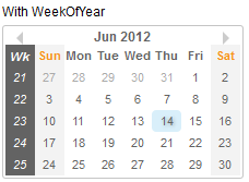
<calendar weekOfYear="true" />
Autopopup Menu for Listbox (CE/PE/EE)
Listbox now provides a default context menu similar to Grid. Set menupopup="auto" on the listhead component to enable it.
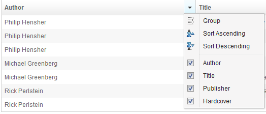
<listbox>
    <listhead menupopup="auto">
        <listheader label="Author" sort="auto"/>
        <listheader label="Title" sort="auto"/>
        <listheader label="Publisher" sort="auto"/>
        <listheader label="Hardcover" sort="auto"/>
    </listhead>
    <!-- listitem entries -->
</listbox>
Scrollview Component (EE)
The Scrollview component is designed for creating scrollable pages on tablet and mobile browsers. It auto-detects the device type and generates scrollbars on desktop, while enabling native-like vertical and horizontal scrolling on touch devices.
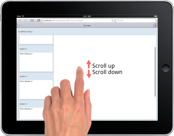
<scrollview vflex="1" hflex="1">
    <zk forEach="1,2,3,4,5">
        <window title="window ${each}" border="normal"
            width="255px" height="200px">
            This is Window ${each}
        </window>
    </zk>
</scrollview>
Cardlayout Component (EE)
The Cardlayout component enables switching between child components like card navigation. On tablets, users can swipe to transition between components with animated effects.
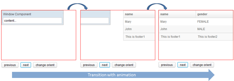
Key features:
selectedIndexproperty controls the visible componentnext()andprevious()methods trigger animated transitionsorientattribute controls animation direction (horizontal or vertical)
<cardlayout id="card" width="300px" height="200px"
    style="border:1px solid red" selectedIndex="1">
    <div vflex="1" hflex="1"
        style="background-color:yellow;padding:20px">
        flex component
    </div>
    <window title="Window Component" border="normal" width="250px">
        content...
    </window>
    <listbox>
        <listhead sizable="true">
            <listheader label="name" sort="auto" />
            <listheader label="gender" sort="auto" />
        </listhead>
        <listitem>
            <listcell label="Mary" />
            <listcell label="FEMALE" />
        </listitem>
        <listitem>
            <listcell label="John" />
            <listcell label="MALE" />
        </listitem>
    </listbox>
</cardlayout>
<hlayout>
    <button onClick="card.previous()">previous</button>
    <button onClick="card.next()">next</button>
    <button onClick='card.setOrient("horizontal".equals(card.getOrient())
        ? "vertical" : "horizontal")'>change orient</button>
</hlayout>