Displaying Calendar Items
Component in MVC Pattern
From the component perspective, Calendars is designed in the MVC pattern:
Calendars(Controller): callContentRendererto render a calendar to the client-side, dispatch UI events to the corresponding event listeners, receives events fromCalendarModelthen render a calendar upon changedCalendarItemCalendarModel(Model): storesCalendarItemContentRenderer(View): renders a calender-related data to the client-side uponCalendarModel
Based on the above architecture, if you want to show some items on a
Calendar, you need to create some CalendarItem objects, put them into
a CalendarModel, and assign the model to Calendars. The default
implementation,
DefaultCalendarItem
and
SimpleCalendarModel,
are sufficient for most requirements.
Create a CalendarItem
Starting from version 3.0.0, we have renamed the CalendarEvent class
to CalendarItem. This change was made to reduce potential confusion
between events on the calendar and events fired by the ZK framework.”
You can simply create a CalendarItem with the default builder:
 DefaultCalendarItem calendarItem = new DefaultCalendarItem.Builder()
                .withTitle("my title")
                .withContent("my content")
                .withBegin(LocalDateTime.now().truncatedTo(ChronoUnit.HOURS))
                .withEnd(LocalDateTime.now().truncatedTo(ChronoUnit.HOURS).plusHours(2))
                .withZoneId(calendars.getDefaultTimeZone().toZoneId())
                .build();
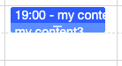
If you don’t specify the title, it displays begin time - end
time at an item’s header: 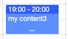
If an item is shorter than half an hour, it appends the content in the header:
Create a CalendarModel
You can instantiate a SimpleCalendarModel with a collection of
DefaultCalendarItem or add a DefaultCalendarItem after
instantiation.
private SimpleCalendarModel model;
...
    model = new SimpleCalendarModel(CalendarItemGenerator.generateList());
    DefaultCalendarItem calendarItem = new DefaultCalendarItem("my title",
                "my content",
                null,
                null,
                false,
                LocalDateTime.now().truncatedTo(ChronoUnit.HOURS),
                LocalDateTime.now().truncatedTo(ChronoUnit.HOURS).plusHours(2)
    model.add(calendarItem);
Assign the Model to Calendars
After creating a SimpleCalendarModel, we need to associate a component
with the model, so that Calendar will render items to a browser.
public class DisplayComposer extends SelectorComposer {

    @Wire("calendars")
    private Calendars calendars;
    private SimpleCalendarModel model;

    @Override
    public void doAfterCompose(Component comp) throws Exception {
        super.doAfterCompose(comp);
        initModel();
        calendars.setModel(model);
    }
Display a Tooltip
To show a tooltip when an end-user hover this mouse on an calendar item, you need to:
- create a popup
- link the popup with your calendars with tooltip attribute.
- implement the logic to show a tooltip in an onItemTooltip listener.
    <calendars height="100%"  beginTime="8"
     apply="org.zkoss.calendar.essentials.DisplayTooltipComposer"
     tooltip="tooltipPopup, position=after_pointer"/>
    <popup id="tooltipPopup">
        <label id="tooltipText"/>
    </popup>
Customizing Calendar Item Appearance
since 3.1.0
From calendar 3.1.0 and onward,
SimpleCalendarItem supports sclass, style, contentStyle and headerStyle attributes.
The sclass attribute will add the specified CSS class at DOM node of the
calendar item (.z-calitem), which allow the whole element to be used in a css
selector.
calendarItem.setSclass("myClass");
    .myClass{ /* selector for the whole node */
        ...
    }
    .myClass .z-calitem-body{ /* selector for a sub-node */
        ...
    }
This is a good way to assign styles to categories of items.
If you need to assign styles to individual items, you can use the style,
contentStyle and headerStyle properties instead: 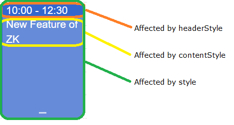
    calendarItem.setStyle("background-color: #0093f9"); //affects the whole item
    calendarItem.setHeaderStyle("background-color: red; color: white;"); //affects the header node, may override setStyle for this node
    calendarItem.setContentStyle("background-color: rgb(255, 255, 0); color: white;"); //affects the content node, may override setStyle for this node
before 3.1.0
Before calendar 3.1.0, only the background color can be customized for the calendar item’s main Node with the contentColor attribute, and the header’s node with the headerColor attribute. These are deprecated after 3.1.0, and should be replaced by style attributes.
Customizing Calendar Item Rendering Logic
since 3.2.0 This section covers how to programmatically customize the rendering logic of calendar items, which is different from the CSS styling approach covered in the previous section. While CSS styling changes the appearance through stylesheets, rendering logic customization allows you to modify the actual content and structure of calendar items at the JavaScript widget level.
Use rendering logic customization when you need to:
- Change the text content displayed in calendar items
- Modify the HTML structure of calendar items
- Implement custom time formatting
- Add dynamic content based on item properties
Understanding Calendar Item Widget Types by Mold
The ZK Calendar uses different JavaScript widget types depending on the mold and item duration:
Their class diagram:
zk.Widget <|-- calendar.Item
calendar.Item <|-- calendar.DayItem
calendar.Item <|-- calendar.DayOfMonthItem
calendar.Item <|-- calendar.LongItem
calendar.LongItem <|-- calendar.DaylongItem
calendar.LongItem <|-- calendar.DaylongOfMonthItem
Default Mold:
- DayItem: Items shorter than one day
- DaylongItem: Multi-day items
Month Mold:
- DayOfMonthItem: Items shorter than one day
- DaylongOfMonthItem: Multi-day items with clone node handling for items spanning multiple weeks
Each widget type has different rendering behavior and templates optimized for their specific display context.
Key Rendering Methods to Override
The main methods you can override to customize rendering are:
getHeader(): Controls the header text content displayed at the top of calendar itemsDayItem: Shows “title time” or “title time-range” formatDayOfMonthItem: Shows “startTime title” formatDaylongItem: Shows “title startTime” formatDaylongOfMonthItem: Shows “startTime title” format
- TEMPLATE objects: Control the HTML structure and layout of calendar items
format(): Controls time formatting (inherited from base Item class)
Implementation Pattern with ZK Override
To safely override calendar widget behavior, use this pattern:
- Use
zk.afterLoad('calendar', function() {...})to ensure calendar widgets are loaded before modification - Use
zk.override(calendar.WidgetType.prototype, exWidget, {...})to properly extend widget functionality - Store the original widget reference in
exWidgetfor potential future restoration
Common Customization Examples
Custom Header Content for Day Items
zk.afterLoad('calendar', function() {
    var exWidget = {};
    zk.override(calendar.DayItem.prototype, exWidget, {
        getHeader: function () {
            var beginDate = this.item.zoneBd,
                endDate = this.item.zoneEd;
            let timeText = (endDate - beginDate < (7200000 / this.parent._timeslots)) ?
                this.format(beginDate) :
                this.format(beginDate) + ' - ' + this.format(endDate);
            return `📅 ${this.item.title} ${timeText}`;
        }
    });
});
Custom Content Rendering
zk.afterLoad('calendar', function() {
    var exWidget = {};
    zk.override(calendar.DayItem.prototype, exWidget, {
        redraw: function (out) {
            this.defineClassName_();
            out.push(this.$class.TEMPLATE.main(
                this.item.id,
                this.domAttrs_(),
                this.params,
                this.getContent(), // Custom content method
                this.getHeader(),
                this.item.isLocked));
        },
        getContent: function() {
            return `📝 ${this.item.content}`;
        }
    });
});
Custom Time Formatting
zk.afterLoad('calendar', function() {
    var exWidget = {};
    zk.override(calendar.Item.prototype, exWidget, {
        format: function (date) {
            // Custom 12-hour format instead of default 24-hour
            return zk.fmt.Date.formatDate(date, 'hh:mm a');
        }
    });
});
Note: The format() method override affects all calendar item types since they inherit from the base calendar.Item class.