New Features of ZK 7.0.0
 Author: Timothy Clare, Potix Corporation
Introduction
ZK 7 focuses on improving the theme system by combining CSS 3, LESS, and Bootstrap technologies. This release includes new components, upgrades to existing ones, enhanced CSS 3 and HTML 5 support, and performance improvements.
Download and Demo


Important Upgrade Notes
Due to HTML 5 and CSS 3 functionality, ZK 7 cannot support IE 6 and 7. IE 8 will display square corners instead of rounded ones. IE 9 requires the commons-codec library version 1.8 or higher. ZK 6.5 continues to support legacy browsers.
Highlighted Features
Enhanced Themes with Bootstrap, CSS 3, and LESS
ZK 7 simplifies theme creation and customization using:
- Bootstrap theme support for seamless application without breaking functionality
- LESS support for cleaner, more concise code
- CSS 3 support for better performance and cleaner implementation
The default theme has been completely revised using CSS 3 functionality.
Why Bootstrap?
Bootstrap offers downloadable themes that ZK developers can use and expand, reducing resources needed for theme production. Designers familiar with Bootstrap conventions gain significant learning advantages when designing for ZK, as ZK’s sophisticated components follow similar naming patterns.
CSS 3 Benefits
Modern browsers support increasing CSS 3 specifications, allowing previous DOM “tricks” to be replaced with simple CSS, resulting in simplified code and major performance boosts.
Designer and Developer Impact
Design and development teams spend less time creating impressive applications. ZUL provides a strong prototyping base, and theme changes reduce the time needed to produce applications matching company themes.
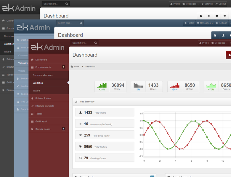
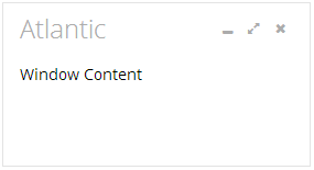
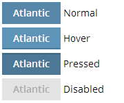
Atlantic Theme
Atlantic is a new flat design theme for ZK 7 that removes gradients, rounded corners, and shadows from the Breeze theme. This makes Atlantic easier to customize.
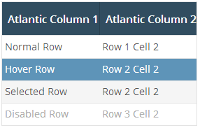
The Atlantic theme is available as a GPL download on GitHub.
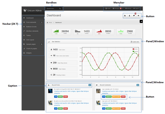
Navigation Component
A new set of navigation components helps developers design navigation menus and sitemaps more easily. The component supports vertical orientation with icons and nested items.
<navbar id="sidebar" orient="vertical">
    <navitem label="Inbox" iconSclass="z-icon-inbox"/>
    <navitem label="Create Task" iconSclass="z-icon-pencil"/>
    <nav label="Next Actions" iconSclass="z-icon-th-list" detailed="true">
        <navitem label="Rescue the Baby" iconSclass="z-icon-star"/>
        <navitem label="Play Darts"/>
    </nav>
</navbar>
Tree: Render on Demand Support
Trees now transparently support render on demand on models for improved performance with large datasets. You can configure the page size in zk.xml:
<tree>
    <custom-attributes org.zkoss.zul.tree.maxRodPageSize="5"/>
</tree>
SLF4J Logging Support
ZK now uses SLF4J as the default logging system, allowing users to switch to Log4j, Simple, or other adapters.
FileUpload HTML 5 Accept Attribute
The File Upload component supports HTML 5’s accept attribute for filtering upload types.
Toggle Tablet UI
Users can enable or disable the tablet UI for a more desktop-like experience by setting the org.zkoss.zkmax.tablet.ui.disabled property in zk.xml.
Performance Improvements
Height and Width
Calculation code has been updated with a 30% improvement.
hflex and vflex
Updated with an approximately 20% improvement, applying to around 70% of components.
Tabbox: Right and Bottom Tab Positioning
Tabs can now be positioned on the right and bottom using the orient attribute.
<tabbox height="300px" width="400px" orient="bottom">
    ...
</tabbox>

<tabbox height="300px" width="400px" orient="right">
    ...
</tabbox>
Static UUID Support
Developers can now use static UUID generation for predictable component IDs. Configure it in zk.xml:
<system-config>
    <id-generator-class>org.zkoss.zk.ui.impl.StaticIdGenerator</id-generator-class>
</system-config>
Audio Component HTML 5 Support
The audio component now uses HTML 5 <audio> tags instead of <embed> tags.

<audio id="audio" height="20"/>
Clients.scrollIntoView Horizontal Scrolling
The Clients.scrollIntoView() method now supports horizontal scrolling to specified components.
Major Tabbox Improvements
Tabbox Supports ListModel
Tabbox now supports ListModel with two implementation approaches.
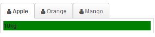
Template Approach (MVVM and MVC)
Uses two templates – model:tab and model:tabpanel:
<div apply="foo.FruitProvider">
    <tabbox id="mytab" model="${$composer.fruits}">
        <template name="model:tab">
            <tab iconSclass="z-icon-user">
                ${each[0]}
            </tab>
        </template>
        <template name="model:tabpanel">
            <tabpanel>
                <div style="background:green">
                    ${each[1]}
                </div>
            </tabpanel>
        </template>
    </tabbox>
</div>
The Java composer class:
public class FruitProvider extends org.zkoss.zk.ui.select.SelectorComposer {
    public ListModelArray fruits = new ListModelArray(
            new String[][] {
                {"Apple", "10kg"},
                {"Orange", "20kg"},
                {"Mango", "12kg"}
            });

    public ListModelArray getFruits() {
        return fruits;
    }
}
Renderer Approach
Developers can create custom renderers implementing TabboxRenderer:
public class MyRenderer implements TabboxRenderer {
    public void renderTab(Tab tab, Object data, int index) {
        tab.setLabel("New -- " + data);
    }
    public void renderTabpanel(Tabpanel tabpanel, Object data, int index) {
        tabpanel.appendChild(new Label("New -- " + data));
    }
}
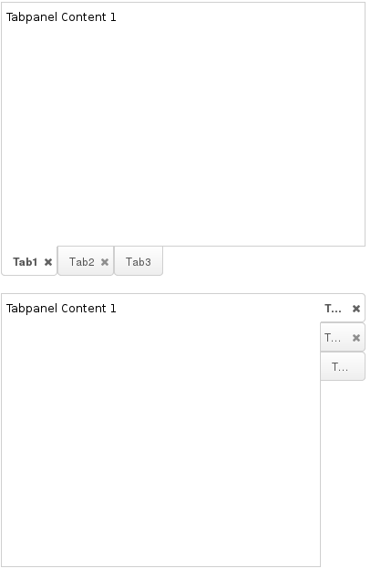
Tabbox Panel Restricted Height
The maximalHeight feature restricts tabpanel heights to the largest panel’s height, ensuring consistent sizing.
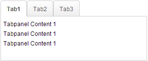
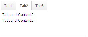
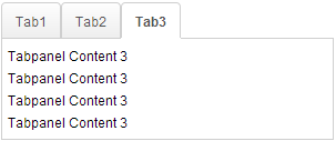
<tabbox maximalHeight="true" width="300px">
    <tabs id="tabs0">
        <tab label="Tab1"/>
        <tab label="Tab2"/>
        <tab label="Tab3"/>
    </tabs>
    <tabpanels id="pnls0">
        <tabpanel>
            <div>Tabpanel Content 1</div>
            <div>Tabpanel Content 1</div>
            <div>Tabpanel Content 1</div>
        </tabpanel>
        <tabpanel>
            <div>Tabpanel Content 2</div>
            <div>Tabpanel Content 2</div>
        </tabpanel>
        <tabpanel>
            <div>Tabpanel Content 3</div>
            <div>Tabpanel Content 3</div>
            <div>Tabpanel Content 3</div>
            <div>Tabpanel Content 3</div>
        </tabpanel>
    </tabpanels>
</tabbox>
Note: This disables client ROD functionality.
Tree: Frozen Column Support
Trees can now freeze columns, mirroring Excel functionality for easier data interpretation.
<tree id="tree" rows="5" width="600px">
    <frozen columns="2" start="1"/>
    <treecols sizable="true">
        <treecol width="100px">ID</treecol>
        <treecol width="50px">Priority</treecol>
        <treecol width="50px">Status</treecol>
        <treecol width="150px">Summary</treecol>
        <treecol width="250px">Detail</treecol>
    </treecols>
    <treechildren>
        <treeitem>
            <treerow>
                <treecell>0001</treecell>
                <treecell>1</treecell>
                <treecell>closed</treecell>
                <treecell>Fix login issue</treecell>
                <treecell>Login does not work at all</treecell>
            </treerow>
        </treeitem>
        <treeitem>
            <treerow>
                <treecell>0002</treecell>
                <treecell>3</treecell>
                <treecell>open</treecell>
                <treecell>Button style broken</treecell>
                <treecell>Check main.css</treecell>
            </treerow>
            <treechildren>
                <treeitem>
                    <treerow>
                        <treecell>00021</treecell>
                        <treecell>1</treecell>
                        <treecell>closed</treecell>
                        <treecell>Fix logout issue</treecell>
                        <treecell>Logout does not work at all</treecell>
                    </treerow>
                </treeitem>
            </treechildren>
        </treeitem>
        <treeitem>
            <treerow>
                <treecell>0003</treecell>
                <treecell>2</treecell>
                <treecell>open</treecell>
                <treecell>Client search result</treecell>
                <treecell>Search service returns incomplete result</treecell>
            </treerow>
        </treeitem>
    </treechildren>
</tree>
Popup Toggle Functionality
Popups assigned via popup/context attributes can now toggle visibility. When set to toggle type, clicking the target component shows or hides the popup.
<button label="Popup" popup="id, type=toggle"/>
Multiple Selection Components: Previous Selection Tracking
SelectEvent now provides a getPreviousSelectedItems() method to retrieve previously selected items, enabling business logic implementation.
se.getPreviousSelectedItems();
Content-Disposition Header Control
Developers can ignore the Content-Disposition header to control whether browsers show download confirmation dialogs.
AMedia media = new AMedia("file", "txt", "text/plain", is);
media.setContentDisposition(false);
Portallayout: Row-Based Layout Support
Portallayout can display as rows instead of vertical columns using the orient property.
<portallayout orient="horizontal">
    <portalchildren width="50%">
        <panel height="150px" title="Yahoo">
            <panelchildren>
                <iframe width="100%" src="http://www.yahoo.com/"/>
            </panelchildren>
        </panel>
        <panel height="300px" title="Google">
            <panelchildren>
                <iframe width="100%" src="http://www.google.com/"/>
            </panelchildren>
        </panel>
    </portalchildren>
    <portalchildren width="50%">
        <panel height="150px" title="ZK">
            <panelchildren>
                <iframe width="100%" src="http://www.zkoss.org/"/>
            </panelchildren>
        </panel>
    </portalchildren>
</portallayout>