New Features of ZK 5.0
 Author: Timothy Clare, Technology Evangelist, Potix Corporation
New Features of ZK 5.0
Author: Timothy Clare, Technology Evangelist, Potix Corporation Date: January 2010
Overview
ZK 5.0 is a major release that introduces a paradigm shift from purely server-centric development to a flexible “Server+Client Fusion” architecture. This article highlights the key new features, including architectural advancements, new components, security and performance improvements, layout enhancements, and many functional additions that make ZK development more productive.
Architectural Advancements
Server+Client Fusion
ZK traditionally emphasized server-centric development for productivity. ZK 5 introduces flexibility allowing developers to choose between server-side or client-side approaches. You can leverage jQuery and GWT alongside traditional server-centric approaches within the same application. The philosophy shifts to “developer-centric” rather than limiting to one paradigm – developers can combine both strategies within the same page, gaining both productivity and controllability without forced trade-offs.
As stated in the release: “It is not about server-centric or client-centric, it is about developer-centric!”
Ajax-as-a-Service
A key architectural innovation permits loading client-side JavaScript packages from distributed servers rather than maintaining local library copies. This eliminates constant update requirements and delivers Enterprise Application Integration capabilities at the client level – providing the same close-knit ease of integration of a backend system but at the client.
The Event Queue
Server push previously required two methods (activate/deactivate) and thread programming knowledge. ZK 5 encapsulates this in EventQueue (org.zkoss.zkmax.ui.eq.EventQueue), using familiar event firing and listening patterns. The system supports two scopes:
- Desktop – visible only to the associated desktop
- Application – visible application-wide to any thread
Asynchronous Listener Support: The EventQueue now handles asynchronous listener processing outside the main thread, preventing users from waiting when listeners require extended execution time.
Licensing Changes
ZK 5 Community Edition transitions from GPL to LGPL (Lesser General Public License), extending its reach beyond GPL constraints. This permits integration with diverse frameworks regardless of licensing models. You are free to use, develop, and deploy your ZK-powered application or framework, regardless of whether it is open source, proprietary, or commercial.
Note: Earlier versions (ZK 3 and older) remain GPL-licensed.
ZK 5 Community Edition Updates
The Community Edition final release adds two features previously exclusive to commercial editions:
- BorderLayout – provides component placement in north, south, center, west, and east areas, enabling complex enterprise interface creation with greater positioning control.
- Client-polling Server Push – allows servers to transmit data without client requests, valuable for instant messaging and stock monitoring applications.
New Components
Flash Charts
ZK 5 introduces flash-based charting components with improved chart rendering aesthetics and customizable styling.
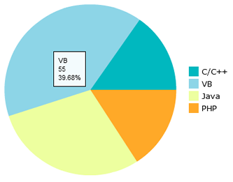
private FlashChart chart;
public void doAfterCompose(Component comp) throws Exception {
    super.doAfterCompose(comp);
    SimplePieModel model = new SimplePieModel();
    model.setValue("2009", "Java", new Integer(500));
    model.setValue("2008", "PHP", new Integer(600));
    model.setValue("2007", "ASP", new Integer(400));
    model.setValue("2006", "C++", new Integer(1200));
    chart.setModel(model);
}
Colorbox
A new color-picker component simplifies color selection for end users. The Component Menu extends its integration support across the framework.
Security and Performance Improvements
Ignoring Foreign Commands
Invisible or disabled components now reject server-sent commands, enhancing security by preventing unauthorized interactions with inaccessible widgets.
ThemeProvider Caching Control
Developers can configure CSS browser caching behavior, reducing unnecessary data transmission and improving performance.
Desktop Reuse
Rather than creating fresh Desktop instances, ZK 5 permits Desktop reuse, eliminating recreation and disposal overhead and providing measurable performance benefits.
Ease of Use Enhancements
Freezing Columns
Grid and Listbox components support column freezing (similar to Excel), improving data readability and interpretation:
<grid>
    <frozen style="background: #dfded8" columns="3">
        ...
    </frozen>
</grid>
Auto-Fitting Columns
Double-clicking column borders automatically resizes columns to fit content width when sizable="true" is enabled:
<grid>
    <columns sizable="true">
        <column label="column 1"/>
        <column label="column 2"/>
        <column label="column 3"/>
    </columns>
    <rows>
        <row>
            <label value="cell1"/>
            <label value="cell2"/>
            <label value="cell3"/>
        </row>
    </rows>
</grid>
Enhanced Datebox
The Datebox component received usability improvements for a better date selection experience.
Ctrl+Click Navigation
Buttons with href attributes now support Ctrl+Click to open links in new browser windows, mimicking standard hyperlink behavior:
<button label="Goto hello" href="test.zul"/>
Layout Improvements
Flexible Layout Support (vflex/hflex)
Any component can embed into flexible containers, enabling controlled layout and sizing based on available space.
Redesigned File Upload
File upload integration works with any widget – buttons, menu items – with enhanced, customizable upload status display.
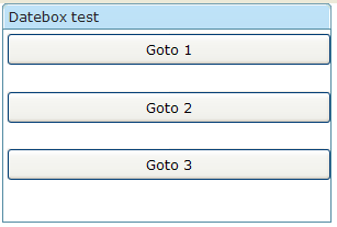
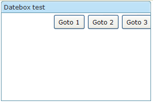
Enhanced VBox and HBox
VBox and HBox now support the XUL box model with align and pack attributes:
- align – controls child element positioning (stretch, start, center, end)
- pack – positions controls within the box (start, center, end)
VBox with align="stretch":
<window width="300px" height="200px" title="Datebox test" border="normal">
    <vbox width="300px" height="150px" align="stretch">
        <button height="30px" label="Goto 1" />
        <button height="30px" label="Goto 2" />
        <button height="30px" label="Goto 3" />
    </vbox>
</window>
HBox with pack="end":
<window width="300px" height="200px" title="Datebox test" border="normal">
    <hbox width="300px" height="150px" pack="end">
        <button height="30px" label="Goto 1" />
        <button height="30px" label="Goto 2" />
        <button height="30px" label="Goto 3" />
    </hbox>
</window>
New Cell Component
The Cell component enables precise Grid and Box layout control through rowspan and colspan properties, allowing content to cross multiple rows:
<row>
    <cell sclass="years" rowspan="12">
        ...
    </cell>
</row>
Rounded Mold
A new rounded mold provides elegant styling for combobox, datebox, timebox, spinner, and bandbox components:
<combobox id="a1" mold="rounded">
    <comboitem label="Simply Rich" />
</combobox>
<datebox id="a2" mold="rounded"/>
<timebox id="a3" mold="rounded"/>
<spinner id="a4" mold="rounded"/>
<bandbox id="a5" mold="rounded">
    <bandpopup>Search</bandpopup>
</bandbox>

Functional Enhancements
CDI Support
ZK 5 integrates Context and Dependency Injection (Java EE 6), enabling Weld-based dependency management alongside ZK components through variable resolvers.
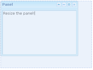
Sizeable Panels
Panels become resizable when sizable="true" is specified, enabling users to adjust panel dimensions interactively:
<panel sizable="true" id="panel" framable="true" width="500px" height="400px"
    title="Panel"
    maximizable="true" minimizable="true" border="normal"
    collapsible="true" closable="true">
    <panelchildren>
        <textbox width="100%" height="100%" />
    </panelchildren>
</panel>
In-Place Editing
Input elements support inline editing via the inplace="true" property:
<textbox inplace="true"/>
<combobox inplace="true"/>
<datebox inplace="true"/>
Button Auto-Disable
The autodisable attribute prevents multiple button clicks by disabling the button during processing:
<button id="ok" label="OK" autodisable="self" />
<button label="enable all" onClick="ok.disabled = cancel.disabled = false"/>
Timebox Format Enhancement
Timebox now supports additional SimpleDateFormat patterns, including AM/PM indicators via the a parameter:
<window title="Test">
    <timebox cols="20" format="a hh:mm:ss"/>
</window>
Fisheye Dynamic Images
The Fisheye control accepts dynamically generated images created with Java2D libraries:
<fisheyebar><fisheye id="fish1" /></fisheyebar>
<zscript>
    import java.awt.*;
    import java.awt.image.*;
    import java.awt.geom.*;

    void draw() {
        BufferedImage bi = new BufferedImage(200, 200, BufferedImage.TYPE_INT_RGB);
        Graphics2D g2d = bi.createGraphics();
        Line2D line = new Line2D.Double(0, 0, bi.getWidth(), bi.getHeight());
        g2d.setColor(Color.blue);
        g2d.setStroke(new BasicStroke(100));
        g2d.draw(line);
        fish1.setImageContent(bi);
    }
    draw();
</zscript>
ToolbarButton and Anchor Component
Toolbar buttons derive from button components with the “toolbarbutton” mold. A new <a> (anchor) component provides standard hyperlink functionality:
<toolbar><toolbarbutton label="toolbarbutton" /></toolbar>
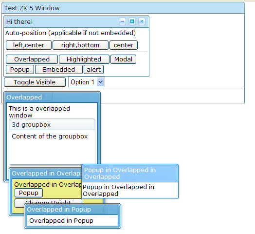
Improved Overlapping Windows
Windows now support better popup functionality and dismissal by clicking surrounding areas:
Nested ID Space Wiring
Controllers can access components in included files using the parentId$childId syntax with GenericAutowireComposer:
Main file:
<window id="mywindow" apply="MyComposer">
    <include id="i" src="includeme.zul" />
</window>
Included file (includeme.zul):
<textbox id="username" />
Composer:
public class MyComposer extends GenericAutowireComposer {
    Textbox i$username;
    ...
}
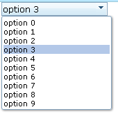
Combobox Keystroke Selection
Read-only comboboxes enable item selection via keyboard input:
<combobox model="${strset}" readonly="true" />
Custom Attribute Data Binding
Custom attributes now support data binding expressions:
<listitem self="@{each=str}" value="@{str}">
    <listcell>
        <button label="drilldown..." onClick='alert(self.getAttribute("btn").item)'>
            <custom-attributes btn="@{str}"/>
        </button>
    </listcell>
</listitem>
Canvas Support
Client-side Canvas element support is available through the zk.canvas package dependency:
<package name="foo" language="xul/html" depends="zk.canvas">
    ...
</package>
Or loaded dynamically:
zk.load('zk.canvas', function () {...});
Script Directive Conditions
Script directives accept if and unless attributes to conditionally include scripts:
<?script src="myscript.js" if="myValue==5" ?>
Configuration Options
Search Engine Crawlability
Enable search engine indexing with:
<system-config>
    <crawlable>true</crawlable>
</system-config>
Custom JavaScript Directories
Specify custom JavaScript file locations to avoid JAR bundling:
<library-property>
    <name>org.zkoss.web.util.resource.dir</name>
    <value>/WEB-INF/cwr</value>
</library-property>
ZK.xml Application Data
The zk.xml configuration file can store application-specific information accessible within applications and custom plugins.